Blog
-
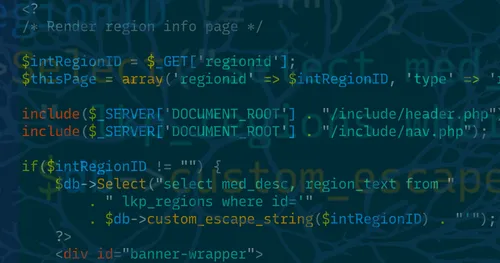
From no framework, to trying every framework, to building our own: here’s why we chose Laravel after decades of web development.
-
We’re thrilled to announce that Bluehouse Group is now an official Laravel Partner! Joining the Laravel Partners program opens up some interesting new doors for us and our clients. Read on to learn more and why we love working with Laravel.
-

Reflecting on a year of growth at Bluehouse Group, this blog explores the values of creating meaningful experiences, building connections, and embracing personal and professional transformation
-

Learn why countdowns may not always meet your user experience goals effectively. Uncover real-world examples and valuable insights to better optimize how you use countdowns
-

Learn how different types of popups affect user experience and discover best practices to minimize negative impacts while boosting conversions.
-
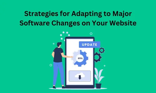
Learn how to manage major software changes for your website. Discover essential tips on planning, testing, and monitoring to ensure smooth transitions and optimal performance.
-

Explore Bluehouse Group's step-by-step guide on setting up Google Analytics 4 to enhance your website's tracking capabilities and help you achieve your goals.
-
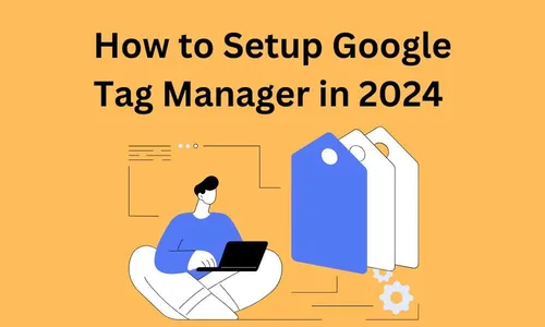
Learn how you can accelerate your analytics tracking with Google Tag Manager, streamline the implementation of custom data tracking codes without relying on developers.
-
Follow our step-by-step guide to navigate UTM Tracking. Learn the ins and outs along with the best practices for creating UTM Tracking codes in 2023
-

Bluehouse Group is gaming all day on November 4th to raise money for UVM Children's Hospital through Extra Life. Learn more about our plans and fundraising goals!
-

Bluehouse Group reveals our two-phase approach, starting with a Discovery & Design phase, followed by a Development & Launch phase. This ensures cost-effective, high-performance software.
-

Every month Bluehouse Group hosts a UX/UI meetup in Burlington, Vermont. For Fall we ran a Design Jam helping the City of Burlington with an open data portal website.