How Countdowns and Their Intent Shape the User Experience
When it comes to design decisions on websites and how they affect the User Experience (UX), it’s important to recognize intent. Countdowns can serve many different purposes. Sometimes, a countdown begins after adding event tickets to your cart, acting as a courtesy to hold your seats until you check out. Other times, we see countdowns for when certain products are being released or launched.
How Countdown Timers Lead to Conversions
No matter the intention behind a countdown, they tap into the visitor’s psyche, influencing them to possess or experience something before it’s no longer available. Psychologically, this is known as the Scarcity Principle.
Countdown timers create a sense of urgency, a limited-time offer can often motivate a conversion.
When a user sees a countdown, they feel an urge to act quickly or miss out on the sale or product. Decision-making isn’t as sharp when a user needs to act quickly, leading to instinctive conversions rather than going through a traditional consumer funnel.
Different types of countdowns have varying levels of effectiveness depending on their context, implementation, and intent.
Courtesy Countdowns
These countdowns give the user time to decide if they are going to convert or make a purchase. We see these timers when we add a very popular product to our shopping cart. When the timer hits 0:00, the item is then removed from the cart so other shoppers can buy it. We also see these courtesy timers for events, movies, or concerts. The venue wants to be respectful and give you time to go through the checkout process, holding your seats for you, but only for a certain amount of time. Eventually, it is only fair to other users to remove your cart so someone else can purchase your seats.
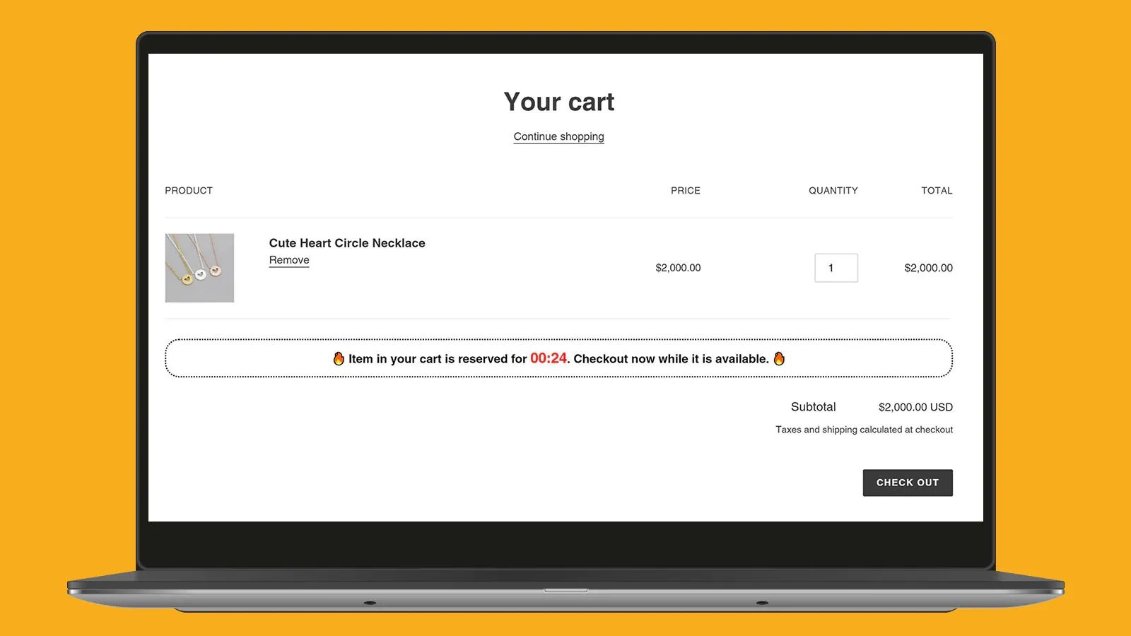
While this is courteous to other shoppers and even to the original buyer, these timers do pose some UX hurdles to be wary of. You want the timers to be long enough that the user doesn’t feel stressed or rushed, but not too long, to be courteous to other potential customers.
Launch Countdowns
These countdowns can be very exciting for the user base. We usually see these when a new product is coming out, like a new technoloogy or a video game. While it’s exciting for the user base, experiencing virtual launches can be a major pain if the website is not suited to handle a lot of traffic. The closer the timer gets to 0, the more traffic your website receives. If ill-prepared, the website could crash, experience incredibly slow load times, and be filled with errors, causing users to become very frustrated, especially if the product sells out despite a user being there on time.
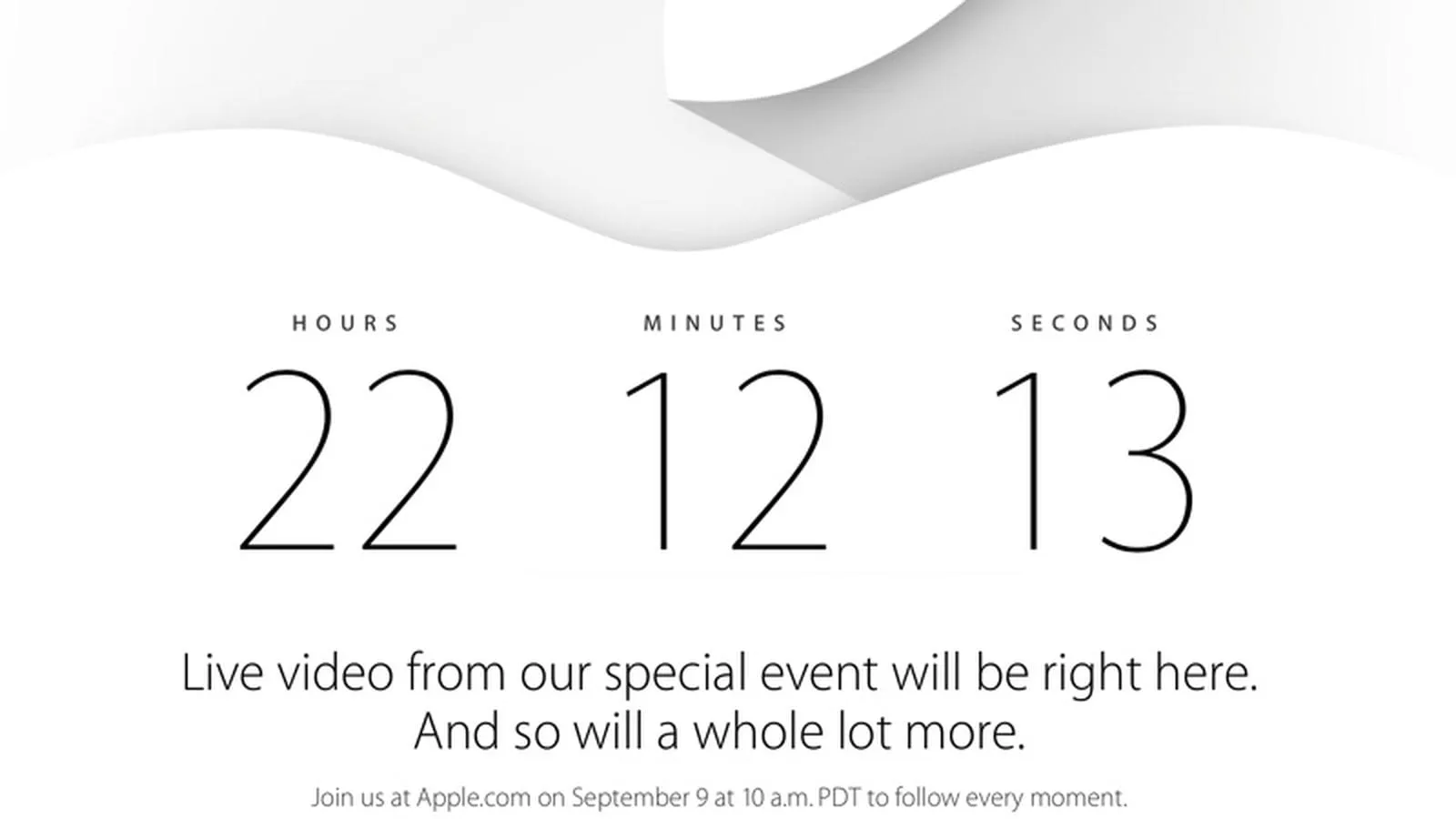
Launches can have an exciting appeal, adding a fun and memorable experience for users, but it still creates a stressful enviroment.
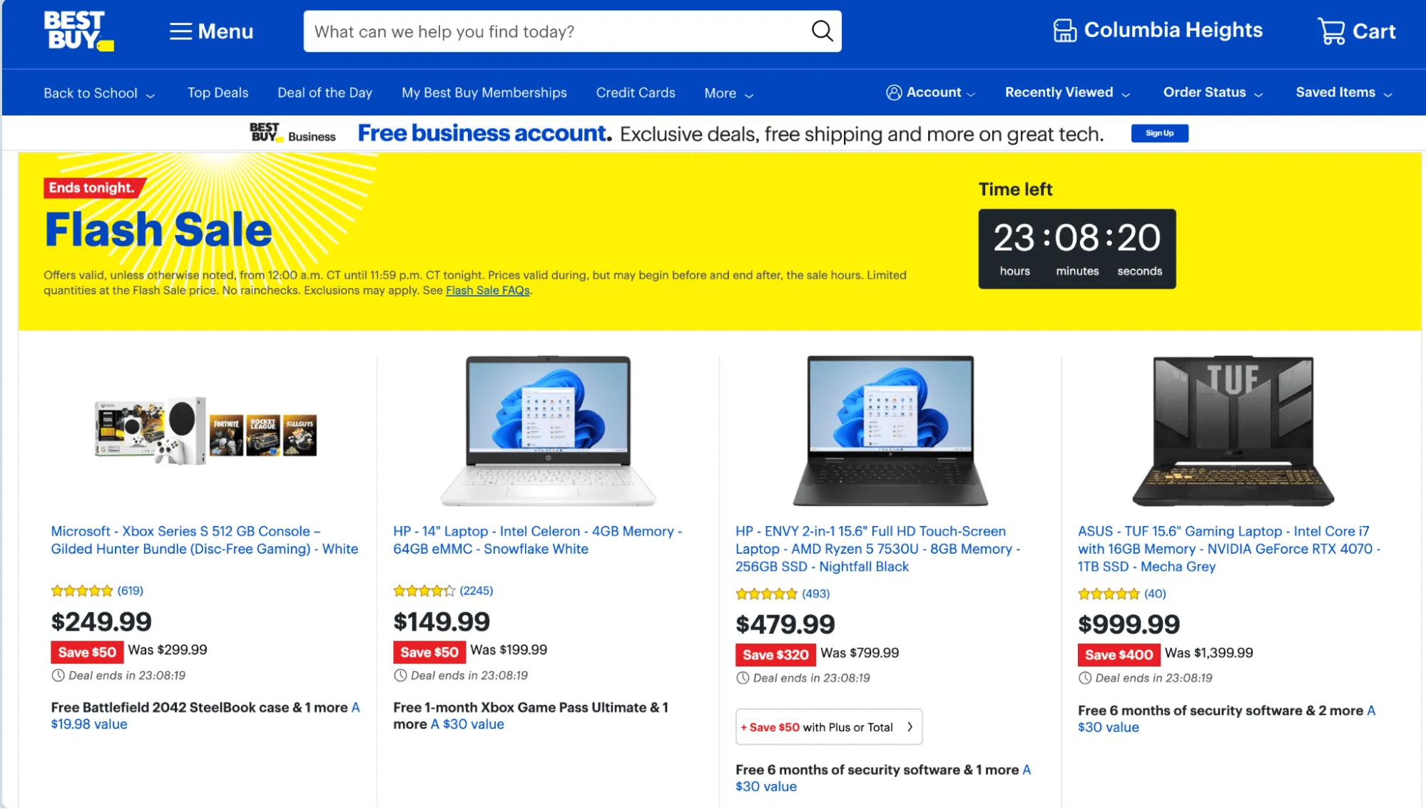
Sale Banner Countdowns
These countdowns typically display how long a sale is happening as a banner at the top of the site. E-commerce sites use them for seasonal sales, and often these timers can have a large duration. They are pretty effective and can linger in visitors’ minds and since the sales usually last a long time they are not as stress inducing on the users.
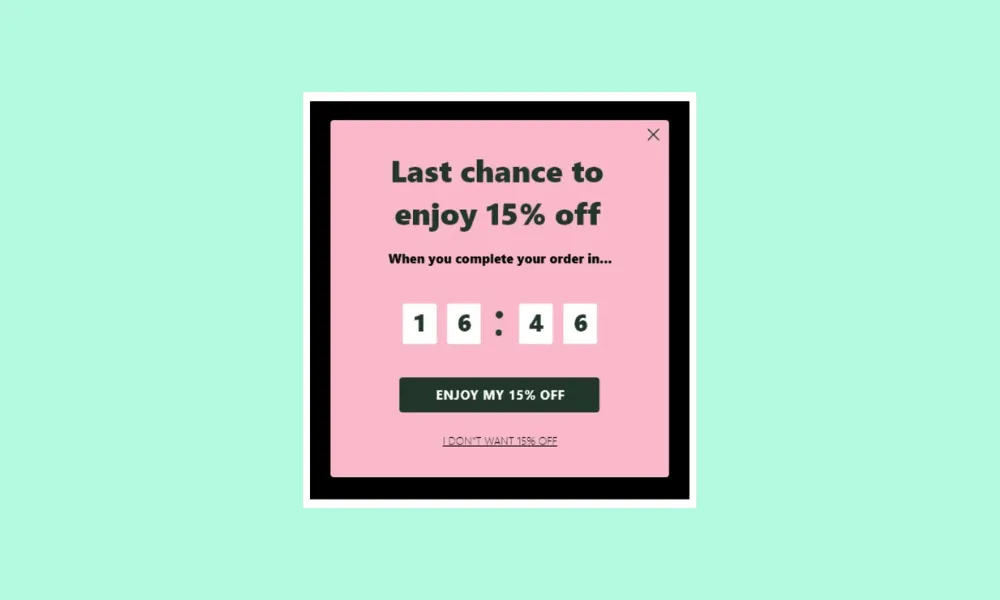
Urgency Countdowns
These countdowns, to me, are the most egregious when it comes to the user experience. They are more of an artificial countdown with a fairly short starting point, typically one hour, but they trigger for every visitor. For example, if your timer to get the sale hits 0, you can simply open the website again from an incognito window and gain another hour with the same exact countdown. Sometimes, they use language saying that you are a lucky randomly chosen user, despite every visitor getting the same countdown and message. The intent behind these countdowns is to prompt a quick and hasty sale. While these countdowns can be effective, they add an unnecessary sense of urgency to the users, and that stress and urgency can leave a negative impact on your user base.
Countdowns ultimately boil down to intent. If you are using a countdown for a deal on a product that is always going to be the same price (even after the countdown), then the intent here is malicious and taking advantage of the user. However, if your intent is to genuinely inform the user and offer a good deal with ample time then that is more acceptable.
How to Improve your Countdowns
Provide a reasonable duration - You could experiment and test out different durations to find a nice balance between conversions and urgency.
Make your Countdown Real and Relevant - If the countdown is all artificial and comes off as a gimmick, this can really hurt your brand’s image. It’s important to create a real offer that a user will actually value.
Use a clear CTA - It’s important to make the action that you want the users to take clear and simple and easy to follow.
Whether used as a courtesy to hold items in a cart, to build excitement for product launches, or to signal limited-time sales, countdowns should be approached with care to avoid causing unnecessary stress or frustration for users. By providing reasonable durations, ensuring relevance, and using clear calls to action, countdowns can be effective while limiting the stress your userbase experiences.