Popups vs. User Experience: Finding the Sweet Spot
It’s hard to balance User Experience (UX) design, marketing, and sales. Many companies that offer products or services use popups to generate leads and sales. While this satisfies marketing and sales, popups can be very frustrating for the end user and sometimes lead to a negative experience, they can even cause users to bounce away from your website completely. Understanding the various types of popups and their levels of intrusiveness can help you decide which popup is best for your brand if you absolutely must use one.
Entry Popups
Entry popups can be very annoying, especially when they’re the first thing you see when visiting a site. They interrupt the user’s browsing experience, distract them, and can be overwhelming.
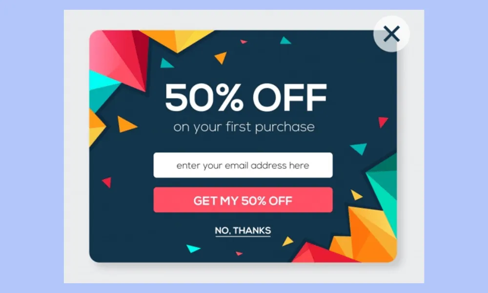
If you must use Entry Popups on your website, it’s generally suggested to show entry popups only after a certain amount of time, once the user is a bit settled in, or after they’ve scrolled down the page a certain distance. Here are ways entry popups can be bad for UX:
- Negative first impression
- Longer load times
- Increased cognitive load
Exit Popups
An exit-intent popup is an overlay that appears as soon as a website visitor shows an intention to leave a page. When their cursor moves out of the browser’s main viewport, it triggers the exit-intent popup. These act as one last attempt to get the visitor to convert, make a purchase, or schedule a call.
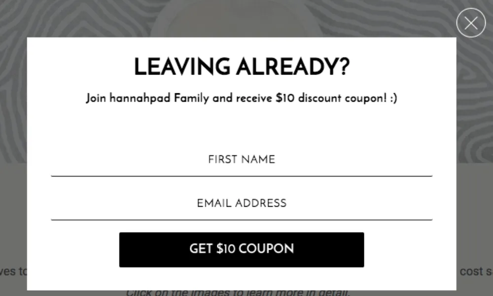
They can be effective, and you don’t need to worry as much about bounce rates since the user is already leaving the website. Here are ways that exit popups can be bad for UX:
- False positives in detection
- Triggered by browser controls
Lightbox Popups
Lightbox popups usually take up the whole screen with a transparent or blurry background. These popups typically force the user to interact in some way, like having to pay to read the content.
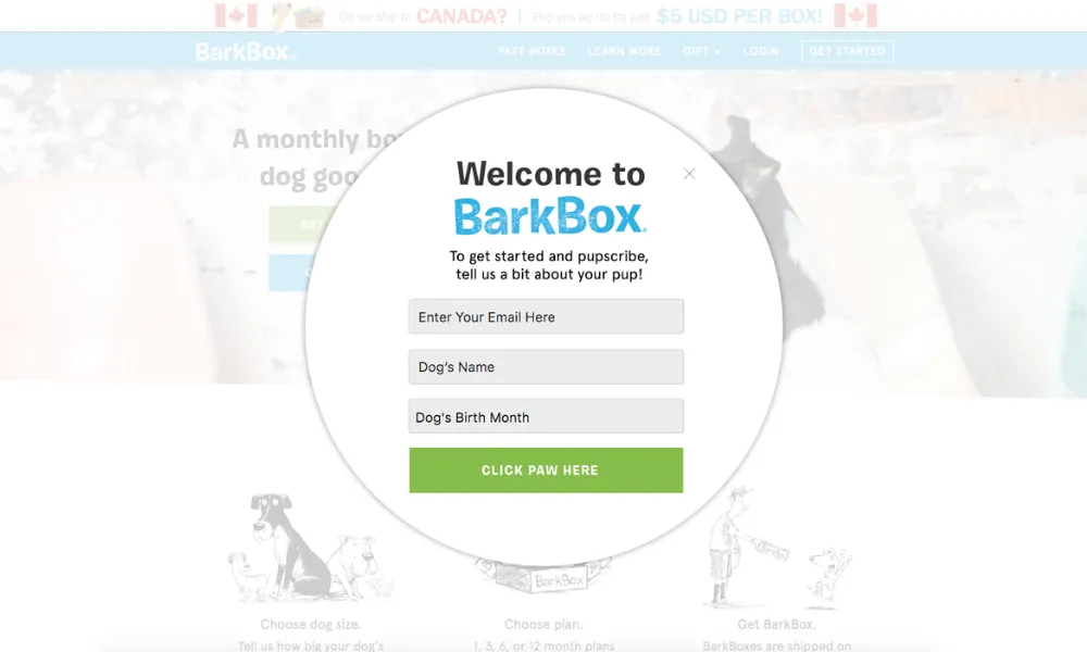
Sometimes, lightbox popups promote deals, provide information about new product launches, or announce events like webinars. Here are ways that lightbox popups can be bad for UX:
- Full-screen obstruction
- Accessibility issues
- Forced interaction
- Difficulty in closing
- Longer load times
Gamified Popups
A Gamified popup is designed to encourage visitor interaction by incorporating a fun game element. You often encounter these on websites offering products. The most common one I see is a spinning wheel where you can win a coupon or free shipping. It’s a clever method to excite visitors, and if the deal is enticing enough, it can drive many conversions.
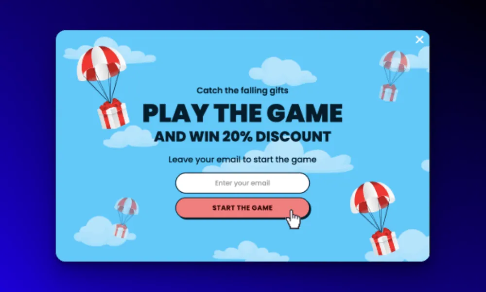
While I’m not a fan of popups in general, I quite like these when done well. Here are ways that Gamified Popups can detract from UX:
- Distracting
- Accessibility issues
- Can appear unprofessional
- Longer load times
Best Practices
If you need to use one of these types of popups on your website, there are a few best practices to follow to make the negative experience of popups less insufferable.
Make it Worth It – If your popup doesn’t offer something genuinely exciting or a good deal, maybe you shouldn’t use a popup at all. Remember, a popup interrupts your users flow, so if you’re going to show them something, it’s worth making sure it’s something they will actually care about.
Keep the CTA Simple and Specific – When it comes to UX, simplicity is king. Ensure your popup is direct and not too crowded or clunky.
Design it Well – Make sure the colors of the popups have contrast, the text is legible, and the CTA is easily clickable. Another important design element is ensuring the popup is easy to close. Far too often, the “X” in a popup is too small and hard to get rid of.
Test on Mobile Devices – Mobile makes up over 60% of all web traffic. If your popup looks bad on a phone or doesn’t work, you are losing out on sales and conversions. It’s crucial that the popup looks great and functions well on both mobile and desktop visits.
Limit the Popups – Your website should really only have one popup. If you start to abuse this and use too many popups, it can seriously disrupt your users’ experience and likely cause visitors to leave.