15 Exemplary Tech Brand Guidelines For Your Design Inspiration
Have you ever stumbled onto a business’s website that just looks like a Frankenstein creation? Each page you view becomes less and less consistent as you get further away from the home page. You begin to feel like each has been slapped together by an intern that just wants to finish up their day and get home.
Every great tech organization creates brand guidelines. They are the template for which an entire public persona is created. They guide employees, media, partners, and customers in the correct way to use your brand assets. If there are no brand guidelines, business operations don’t run smoothly.
A successful technology brand evokes consistency. They are remembered and defined through repetitious sightings. So, what is a brand style guide?
A brand style guide is a document or webpage that chronicles the ins and outs of your brand elements. Think of it as a set of rules on how to use your brand’s logos, colors, element positioning, collateral look and feel, and much more. It allows your organization to form, plan, and maintain all identifying features.
If you’re reading this, you’re probably interested in either starting your own brand style guide or refreshing an out-of-date one. Before you do either, take a look at these 15 exemplary guides from well-known tech brands for inspiration.
15 Tech Brand Guideline Examples
Slack Brand Guidelines
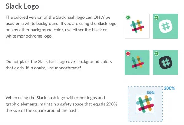
Slack is the fastest growing business-chat solution on the market. What else are they known for? Being absolutely meticulous with all of their branding initiatives. They store much of their downloadable content on Brand Folder, a digital asset manager. It provides easy access to both press assets and visual mockups for users.
View the full Slack style guide here.
Netflix Brand Guidelines
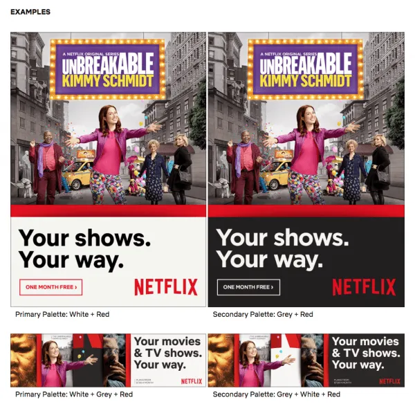
Netflix is constantly expanding to new product offerings, geographic regions, and languages. It’s critical for them to get their brand consistent as they expand. Their brand style guide is simple and to the point. There shouldn’t be any mistaking which assets can be used in any given scenarios.
View the full Netflix style guide here.
WhatsApp Brand Guidelines
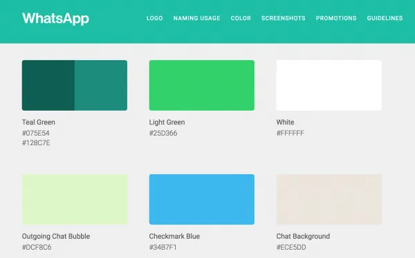
WhatsApp, a messenger application, has combined their values, attributes, and design principles into their own single-page domain. It’s a separate experience from their official website, which provides easy navigation and a streamlined walkthrough.
View the full WhatsApp style guide here.
Skype Brand Guidelines
With Microsoft’s acquisition of Skype, it’s important they don’t lose their brand identity. Although the style guide is hosted on Microsoft’s domain, it’s kept the unique features that helped position Skype as one of the most promising multi-channel chat platforms. One of these unique features: they’ve incorporated an FAQ format that helps users using common question search terms quickly find the right information.
[View the full Skype style guide here.
](https://www.skype.com/en/legal/brand-guidelines/)
Snapchat Brand Guidelines
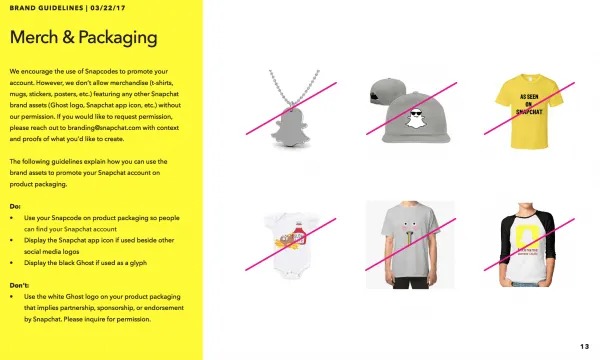
As a young, fast-growing social media brand, SnapChat has made many different kinds of waves. They’ve developed a quick and easy outline that covers all their assets in a few short slides. The strange thing is, even though it’s brief, it works extremely well.
View the full Snapchat style guide here.
LinkedIn Brand Guidelines
Given LinkedIn is all about connecting the business world and building your personal brand, it would make sense that they have developed a strong style guide. LinkedIn promotes a clean, cross-cultural image that all their users can quickly identify. They cover everything from downloadable assets, color palettes, and social media etiquette.
View the full LinkedIn style guide here.
Microsoft Brand Guidelines
Microsoft has a multitude of brands under their umbrella, and keeping track of all of them is a complicated task. They’ve built a sortable image gallery that ranges from brand logos to hardware photography.
[View the full Microsoft style guide here.
](https://news.microsoft.com/imagegallery/?filter_cats%5B%5D=2333&filter_cats%5B%5D=)
Adobe Brand Guidelines
Adobe doesn’t try to make anything fancy, but they make sure their guide is on point. They have a large portfolio with multiple reseller and consultant programs so the rules need to perfect. Adobe is the perfect example of a template that doesn’t focus on flashy features and instead lays out the content in a quick and easily digestible fashion.
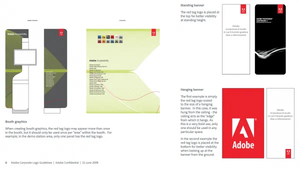
View the full Adobe style guide here.
Instagram Brand Guidelines
Instagram is all about visuals: it’s a social network that makes their impact using imagery. It makes sense that their brand style guide is comprehensive and visually appealing. They take advantage of whitespace when needed and use high-quality photography everywhere else.
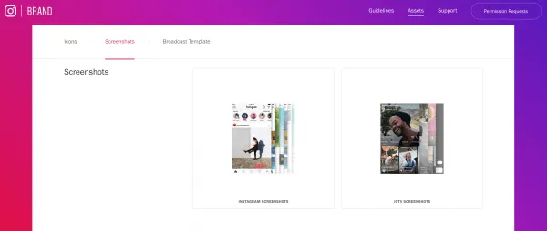
View the full Instagram style guide here.
AirBnB Brand Guidelines
Instead of the traditional style guide, AirBnB decided to opt for a UI toolkit on Dribbble. Their creative team rolled out a redesign in 2014 that was met with plenty of accolades. They are a visual and technical team, a hard combination to find.
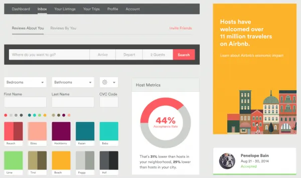
[View the full AirBnB style guide here.
](https://dribbble.com/shots/1669299-Airbnb-UI-Toolkit-Web/attachments/263198)
Spotify Brand Guidelines
Spotify’s style documentation is made for developers since they are party to many application integrations. Though the assets are geared towards application development, they follow many of the same criteria as typical brand resources.
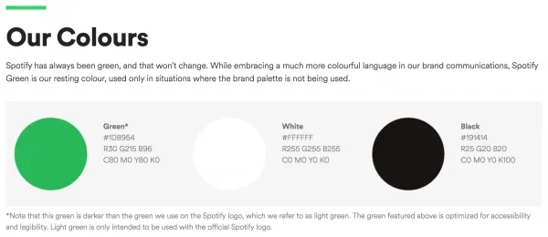
View the full Spotify style guide here.
Uber Brand Guidelines
Uber has bounced from PDF files to a fully immersive “digital experience” sub-site over its short life. They’ve settled for something in the middle, with a subfolder that caters to both media and developers. There is everything from logos to icons to development frameworks.

View the full Uber style guide here.
Google Brand Guidelines
Another well-known tech brand you’d expect to see on this list. Google has created one of the best directories for essential design tools and brand regulations. Like most things, Google created their guide with user experience in mind.
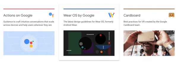
View the full Google style guide here.
Twitter Brand Guidelines
Twitter gives you two options: explore their brand resources on their company page or pull down a zip file of everything you’d ever need for future use. From how to treat a Tweet to embedding templates, Twitter has their brand needs covered.
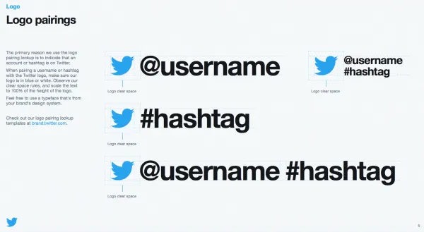
[View the full Twitter style guide here.
](https://about.twitter.com/en_us/company/brand-resources.html)
Facebook Brand Guidelines
Facebook is the only organization on this list that added a ‘request new features’ section to their style site. You can submit a request for new brand resources to be added to the assets documents or identity guide, which makes it an exceptional customer service tool as well.
